
The cover design of my latest novel, Another Life, has been praised by reviewers, bookshops and readers. Undoubtedly, most of the credit must go to my publisher, Burton Mayers Books, for their creation of a compelling image from an accurate interpretation of the story.
Cover design is both an art and a science. The objective is to sell books. The publisher must present potential readers and purchasers with an image relevant to the genre that stands out from its peers. It should hint at the tone and content and be memorable.
To achieve these objectives, the publisher must consider how people choose books. They may respond to a review (with or without an image), a recommendation, an advertisement, a listing. In many cases, they will encounter the book by chance in a bookshop. With hundreds of books released each week, if the title and author are not noted, they might soon be forgotten and the sale lost. A memorable cover will assist the prospective purchaser to find it again. A clear message is essential.
I’d like to share the journey taken by Another Life, from my original idea to the vision of my publisher and the process we followed.
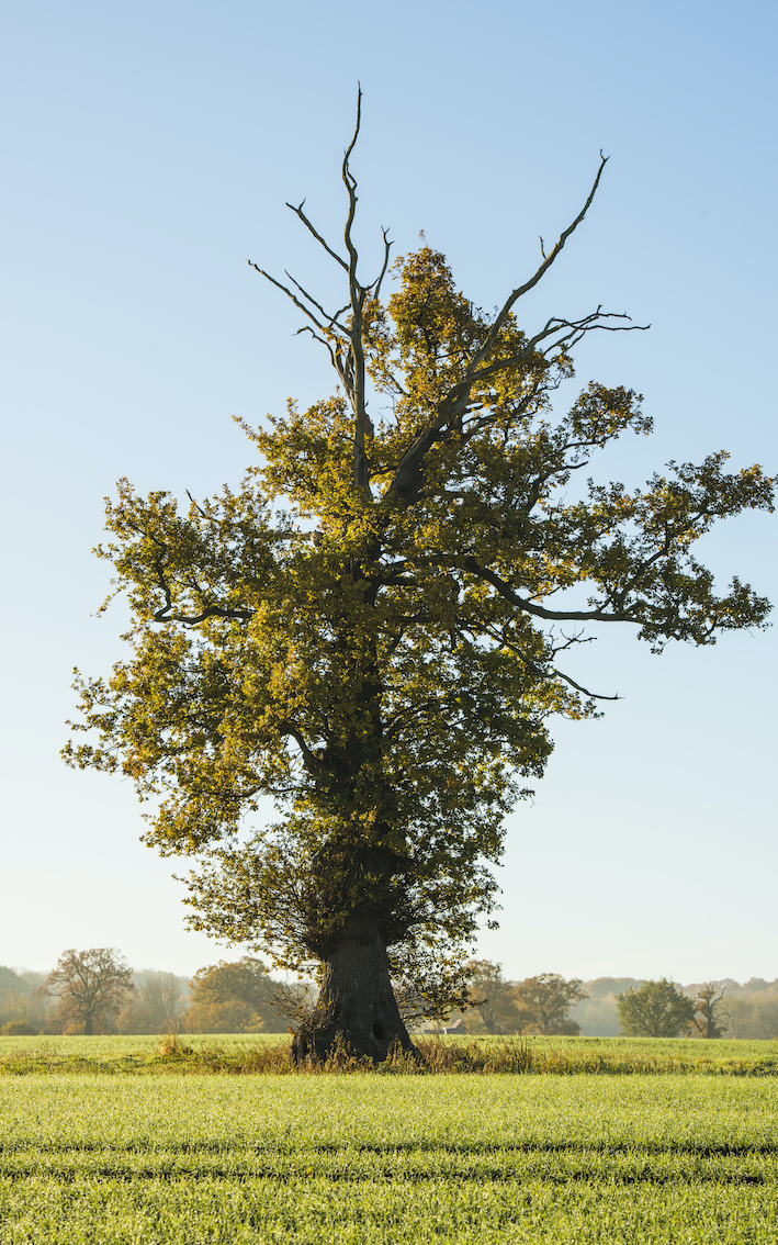
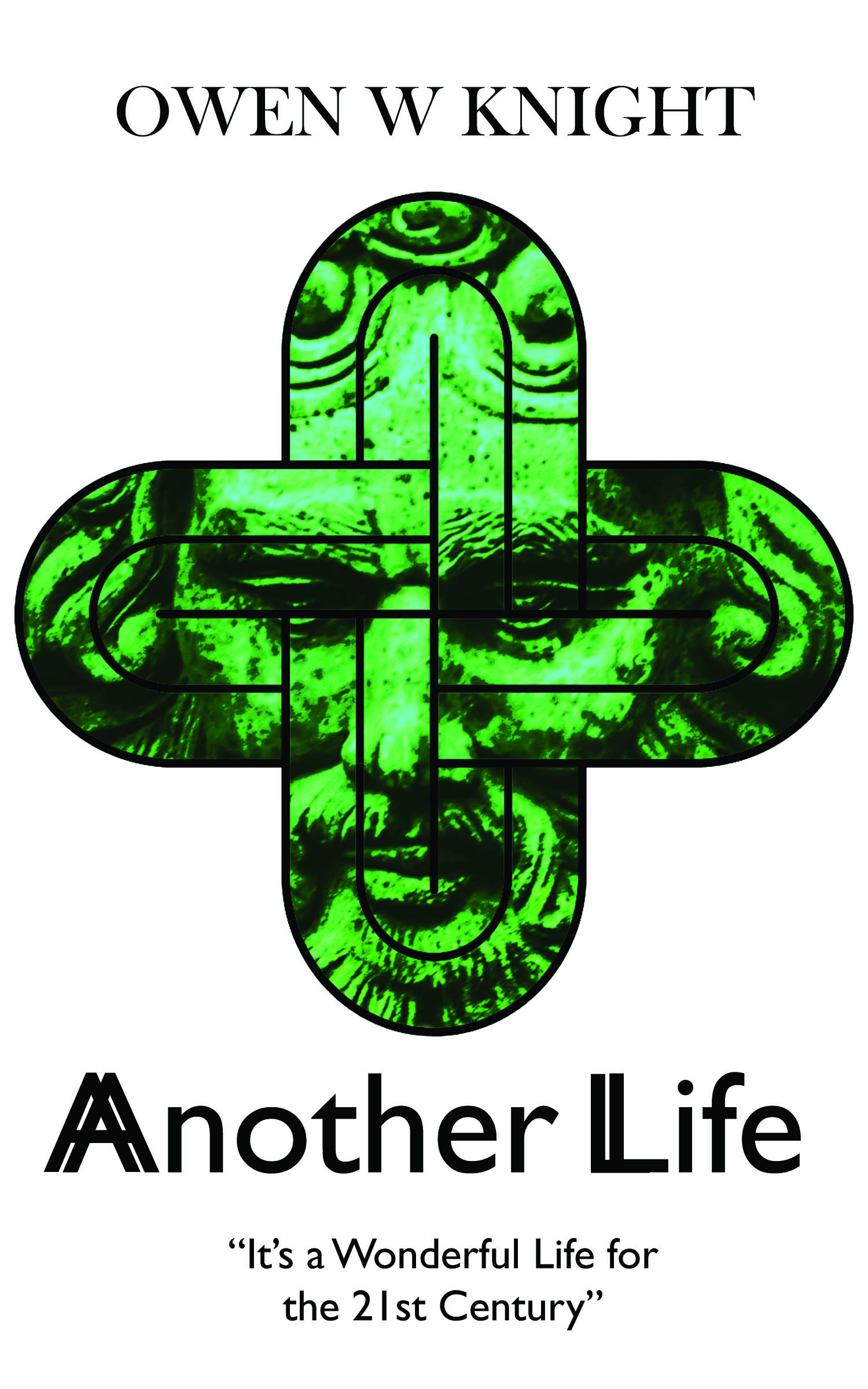
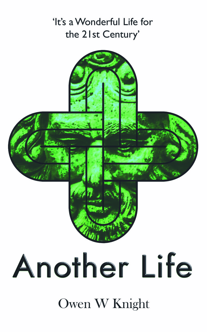
I was keen for the front cover to include the image of an oak tree, half-alive, half-dead, based on a photograph I had taken. I also wanted to include a representation of the Green Man. Both of these are relevant to the book. The tree was not a problem; inclusion of the Green Man was more challenging. I sent my publisher two versions of the oak tree photograph, taken in summer and autumn, together with an outline idea for a wrap-around image for the whole cover, in which the Green Man appeared, half-hidden. My preferred Green Man was another photo, eventually used as the basis for the final design.
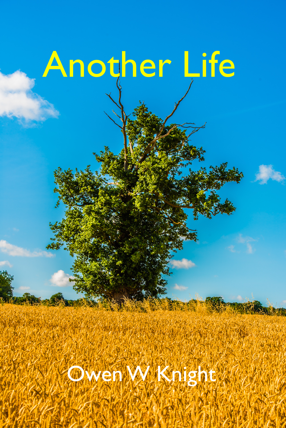
I considered this proposal to be striking, relevant and simply-presented. The publisher had other ideas. His first idea, for the front cover, was completely different from mine.
I had to reframe my thoughts to accommodate the concept. I recognised, firstly, that his design skills and available tools were superior to mine. Secondly, that he was in business to sell books, whereas my ideas were in the realm of vanity.
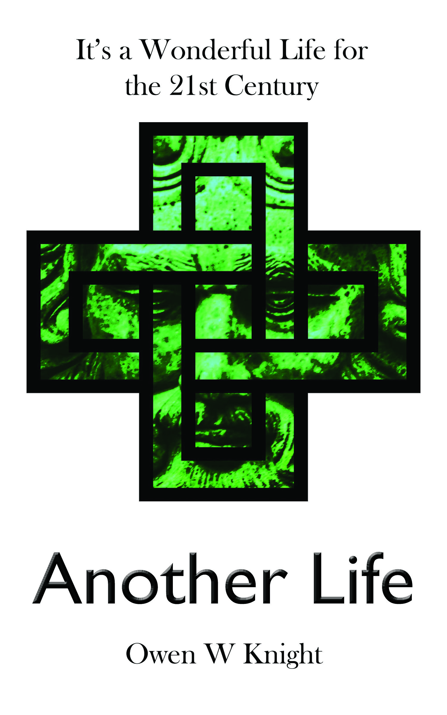
I liked the idea of the Green Man enclosed by a Solomon’s Knot, an important part of the story. I admired the simplicity of the design: a plain white background with nothing more than the image, the title, author’s name and tag line. The double iteration of the initial letters of Another Life I considered to be a step too far in subtlety and legibility. I thought that the positioning of the three items of text could be improved.
The next version improved the text positioning.
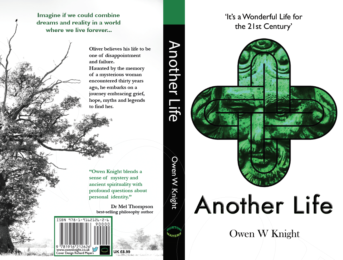
The publisher had changed the Solomon’s Knot outline from curves to straight lines. To me, this resembled a swastika and could be off-putting. We quickly reverted to the original shape and, after experimenting with a few font designs, moved on to the rear cover.
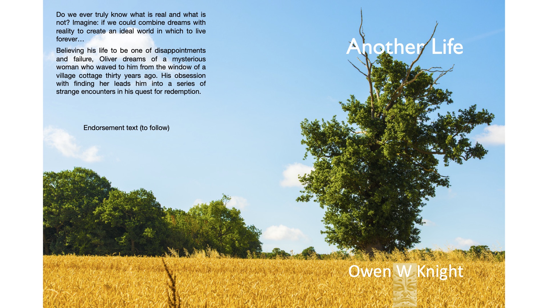
The rear cover design demanded inclusion of several elements: a hook, an image, the synopsis, a review and the sales information (barcode, publisher and price). In contrast to the simple design of the front cover, we had to overcome several problems. It is not easy to incorporate three separate text blocks, particularly with a coloured oak tree and its numerous branches, in a readable form. Ideally, you want the prospective purchaser to read the hook first, then the short additional detail of the synopsis and to confirm their judgement and decision with the review.
In the first draft, the text was insufficiently readable owing to the tree taking too much space.
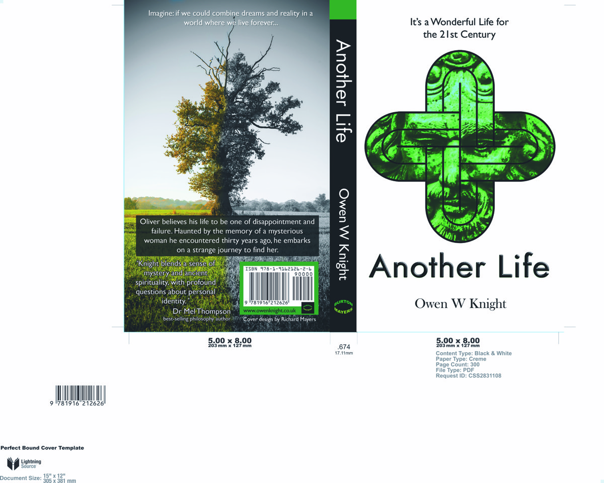
The second draft reduced the tree to an outline, moved towards the left-hand edge, although there was an imbalance between the bright white front and the gloomy back cover. Ultimately, Another Life is an uplifting book.
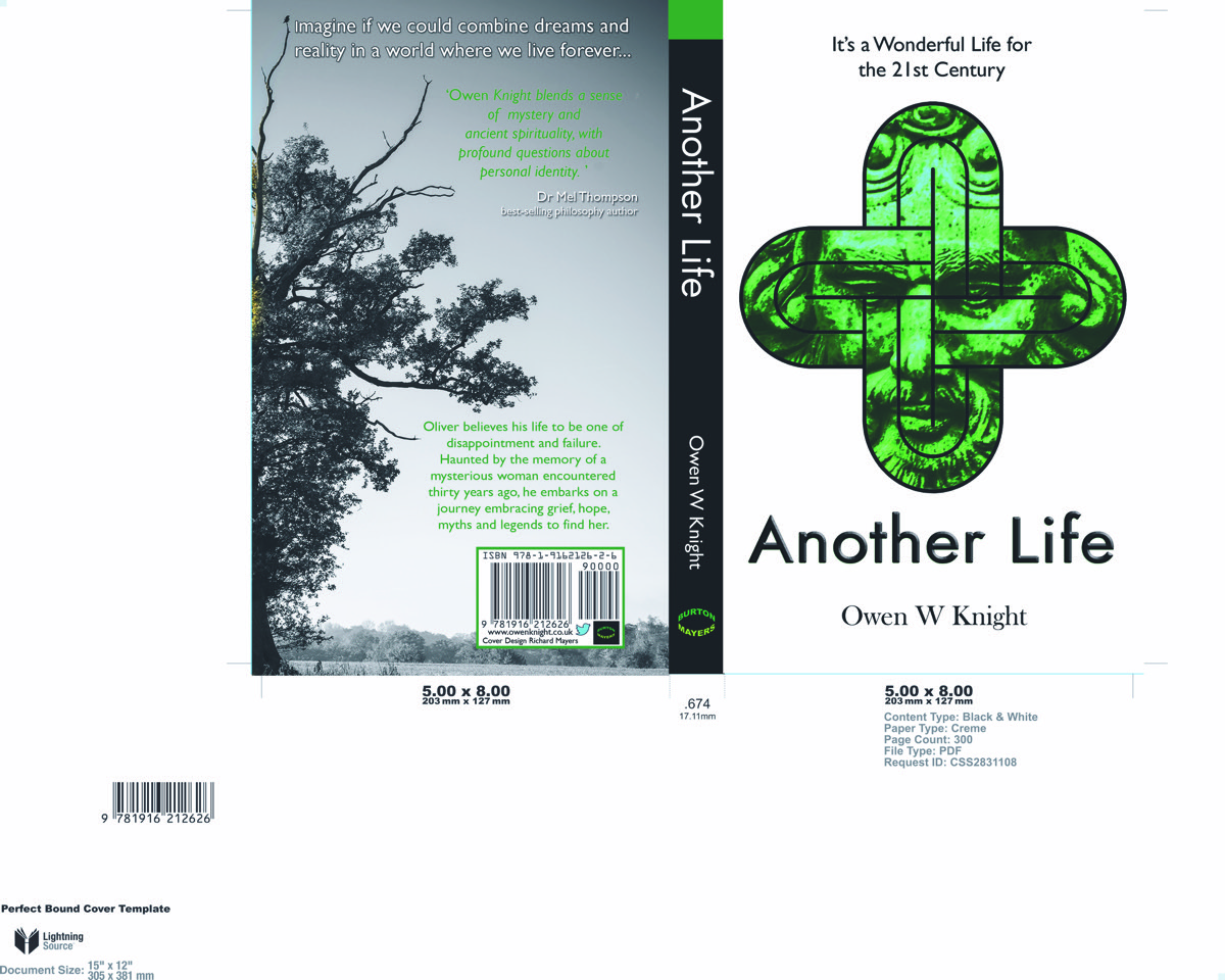
These issues were resolved in the third and final draft. And so, less than four weeks after starting the process, we agreed on the final design. I had no comment to make on the spine. The title, author name and publisher are clear and easy to find on a bookshelf.
I was fortunate to be taken on by a small, focussed, independent publisher who encouraged and welcomed my input. Obviously, he had the final say and steered me in the right direction.
His own take on the process is described on his website:
‘Owen Knight’s book, Another Life, explores many themes, including folklore, philosophy and the old religion. Owen was very keen to have a large oak tree in his front cover to represent the Green Man, however, this didn’t really look too engaging.
Since we read all of the novels we work on, we understood the significance of a Solomon’s knot and the architecture of churches in the Cotswolds. Owen provided an image he had of the Green Man and we found a vector image of a Solomon’s knot. Combining the two with a clean white cover, connoting the afterlife, and a classic serif font, the final cover makes a striking impression and has been well received by readers and bookshop owners.’
Further information on Burton Mayers Books’ approach to cover design can be found here.
Leave a Reply